Rebuilding a Brand
Unified a fragmented school brand into one system that kept growing after the project ended.
2018-2022
Aquinas College is a high school of around 1,800 students and 200 staff. I worked as their in house graphic designer for four years, as part of a two person marketing team responsible for the school's visual communications output.
Role
BRANDING, CREATIVE DIRECTION, UX/UI DESIGN, PRINT DESIGN, PHOTOGRAPHY

Challenge
The entire brand needed a refresh. The existing logo was hard to use and read, and there was no consistent brand application across the school. Work commissioned from different designers and agencies over the years only loosely matched, sharing a colour palette or semi‑consistent font use at best, with nothing feeling like part of one connected system.
Our two person communications team had to tackle a project of this scale while still keeping up with ongoing internal design work.
With a waiting list for student enrolment, the school was already hitting its success metrics, which made it harder to justify investment in a brand, website and prospectus refresh. The case had to be made on grounds beyond immediate enrolment numbers.
Approach
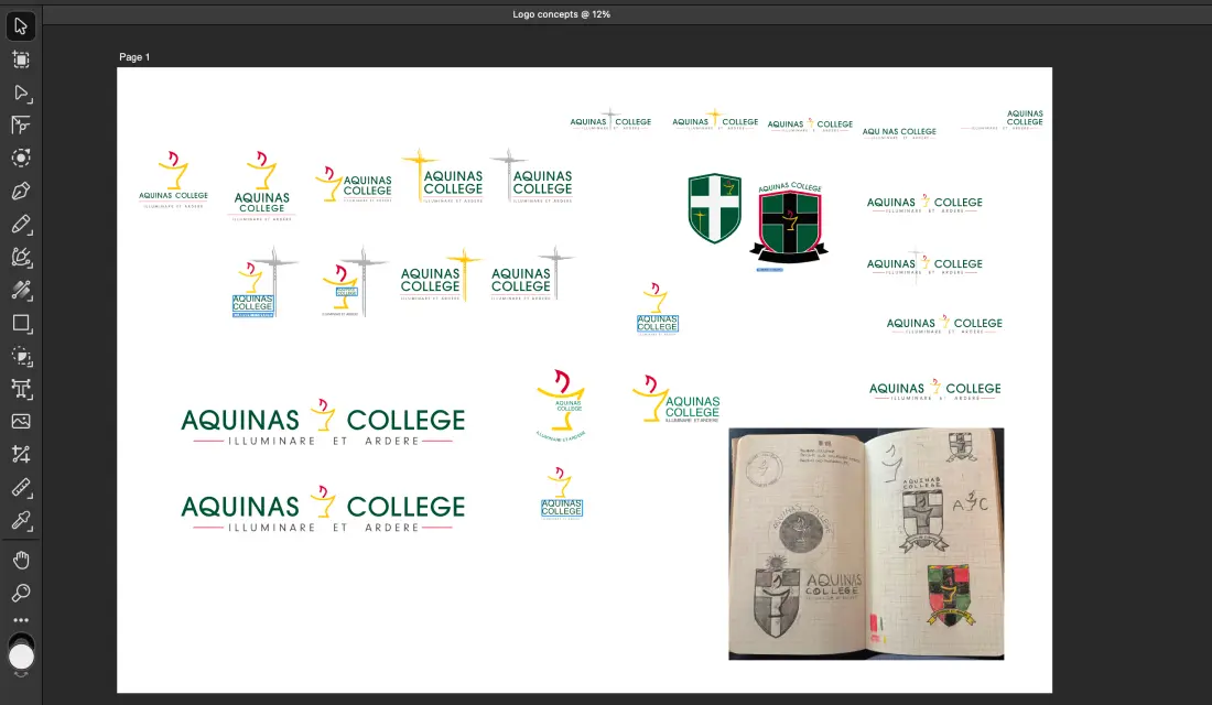
Logo exploration
Work ran across branding, the prospectus, admin collateral and website, with usability a constant thread throughout.
Working in house allowed me to run low cost, easy to implement changes alongside the broader brand update, testing what landed and folding learnings back into the bigger system. Font and primary colours were largely already set, so a lot of my focus went into refining how they were used. The old branding had chased the look of centuries-old traditional colleges without landing it, so I leaned into the school's real 60 year history instead: modern, but with weight and gravitas.
Process
We ran a competitor analysis covering both direct competitors in the area and comparable schools across the broader sector to understand where Aquinas stood and what was realistically achievable, improving perception without pretending to be something it wasn't, like an elite private school.
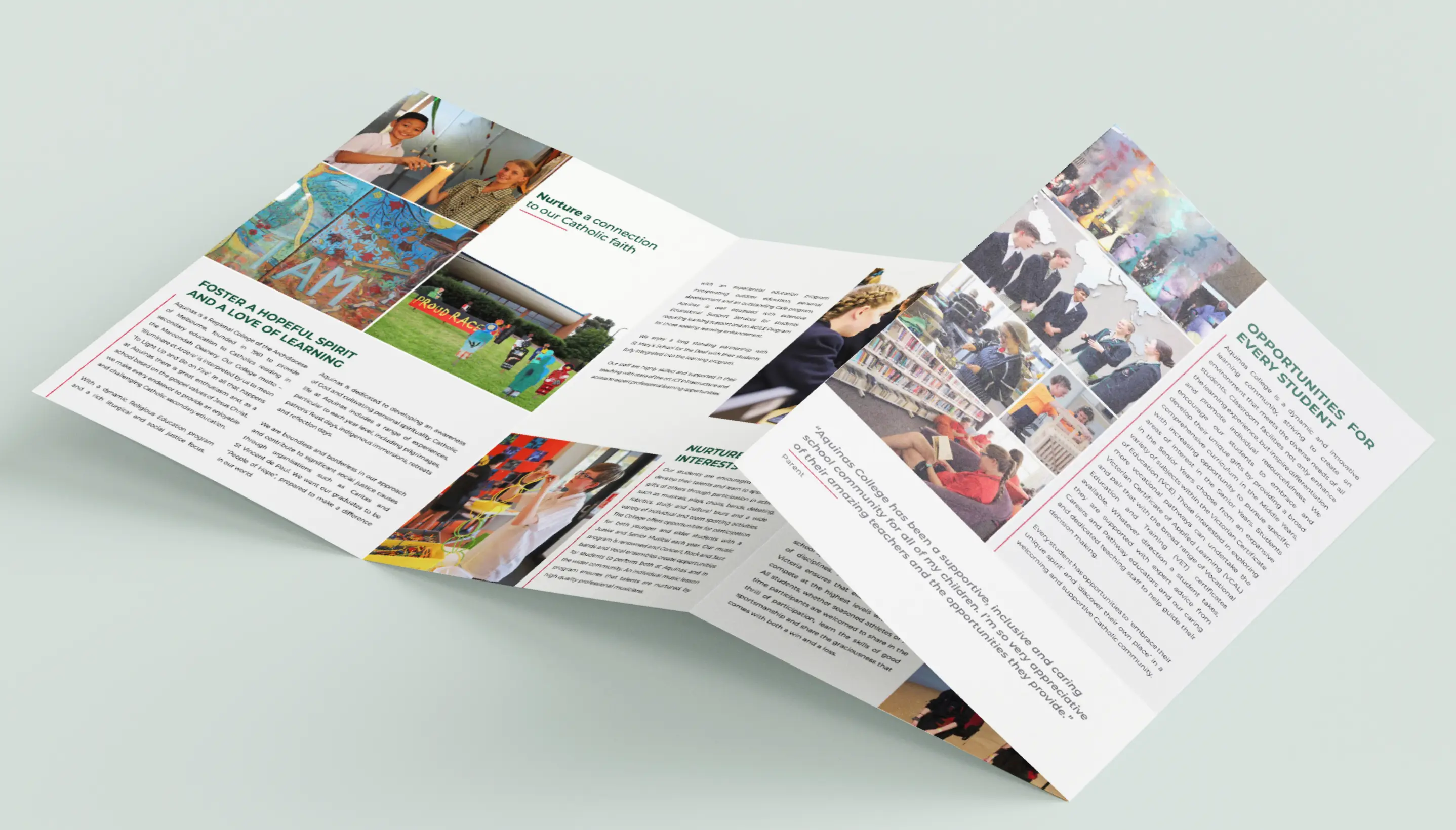
Print materials were chosen carefully, using spot gloss on logos and photography to give everything a considered, premium feel, and sourcing a new print supplier who wouldn't compromise the brand in production was just as important. We also found a reliable website developer to handle ongoing hosting and development, working closely with our designs to keep the site true to the brand.

Getting anything approved meant working through multiple layers of stakeholders - leadership, the board, plus the internal politics and emotionally driven opinions that come with education.
Final Design
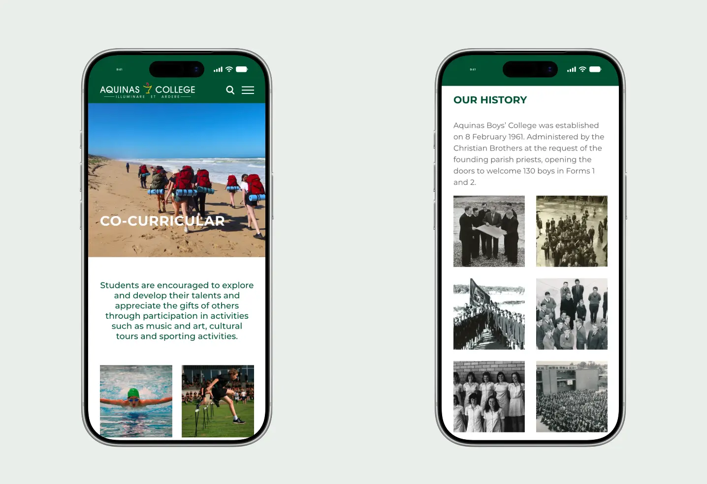
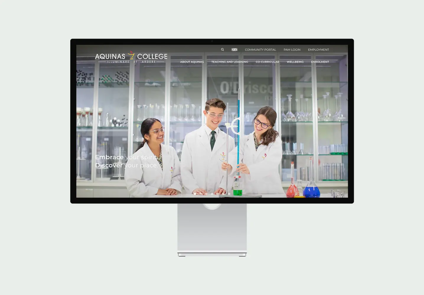
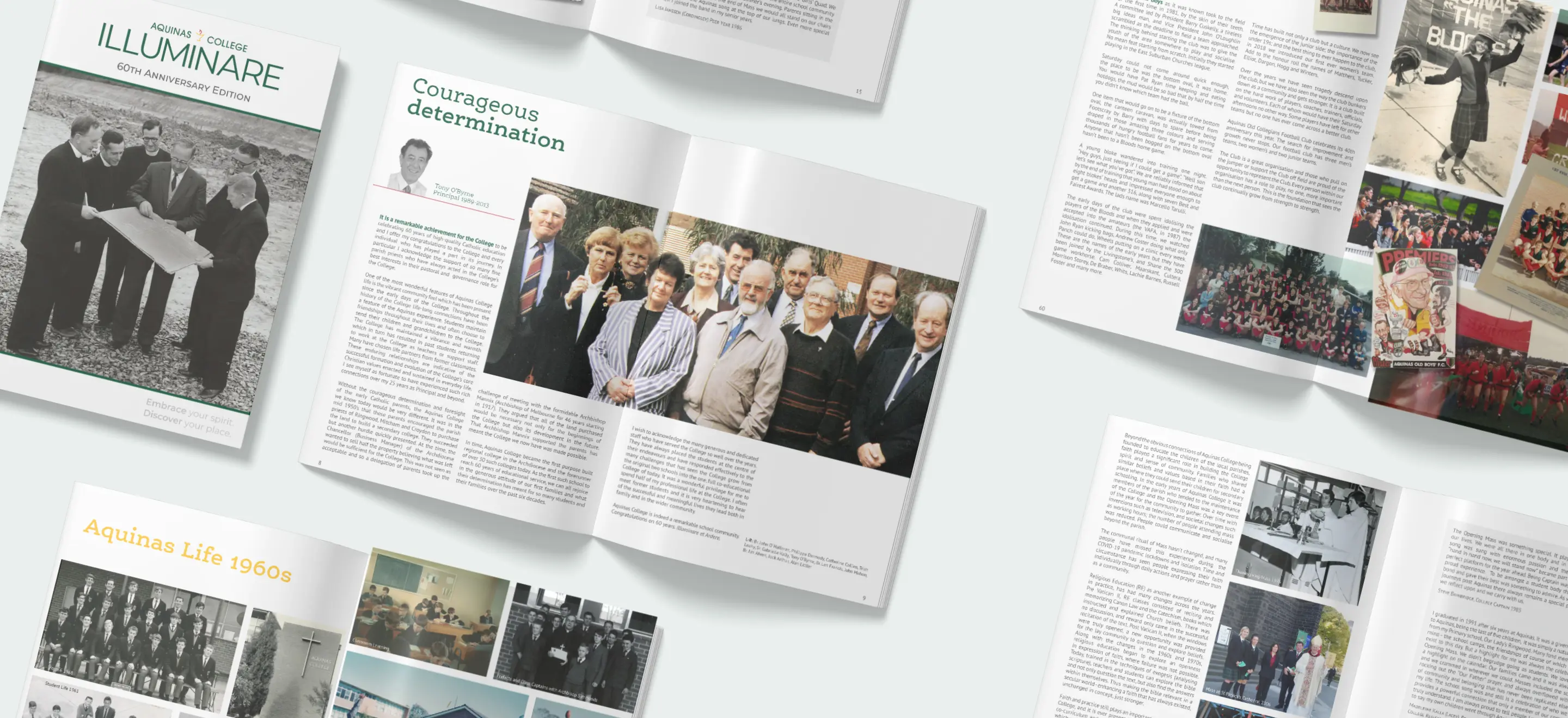
The project produced a complete brand refresh, including logo, guidelines, prospectus, website administrative collateral and updated signage. Rolled out progressively across internal and external touchpoints, all were built for clarity and ease of use.


OUTCOME
Feedback from leadership and parents was positive, and staff appreciated finally having clarity on what to use and what to avoid. The identity held together across every touchpoint, to the point where materials were recognisably Aquinas even without the name on them.